
To apply the powerful statistical analysis function of the DiVoMiner platform, you can either quickly view the data and generate charts in [Coding Result], or go to [Basic Statistics] under [Statistical Analysis] to customise and generate the required personalised charts, which meets diverse visualization needs. During statistical analysis and visualization, the platform supports with interactive querying, statistics, dynamic displays, and information prompts through mouse drag-and-drop interactions. Moreover, it enables customized design of charts based on user preferences, autonomous selection of variables and dimensions, data filtering, and name editing of variables.
In addition to the commonly used charts such as tables, bar charts, stacked charts, pie charts, line charts, area charts, radar charts, heat maps, area maps, scatter charts, the platform also supports prevalent visualization in textual analysis of the word clouds, Sankey diagram and more. In the future, DiVoMiner will introduce a wider array of chart types.
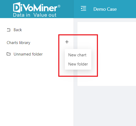
User will find it empty when they first enter the [Basic Statistics] page, it is besause that you haven’t created any charts or folders yet. Click the small “+” icon in the top left corner and choose “New Chart” or “New Folder.” Folders are used to organize and store the charts you create. It’s suggested to start by making a new folder to help keep your customized charts organized.
The graphing page displays variable options on the left, including three main categories: [Custom Variable], [System Variable], and [Algorithm Variable]. Each type allows for comprehensive analysis, with the distinctions as follows:
- [Custom Variable] encompass user-uploaded and coded categorical data, stemming from user-defined data processing.
- [System Variable] include default system variables like machine-coded and manually coded.
- [Algorithm Variable] include those generated post execution of algorithm models within the [Algorithm & Mining] page.
Next, by dragging the variables to the “Dimension” column, statistical results will be displayed. Then, on the right-hand side, you can select the desired visualization type in the “Chart Type” section. Below that, you can customize the chart parameters to achieve the best visual output. Lastly, input the chart title and subtitle, click [Save] at the bottom and choose the folder for storage.
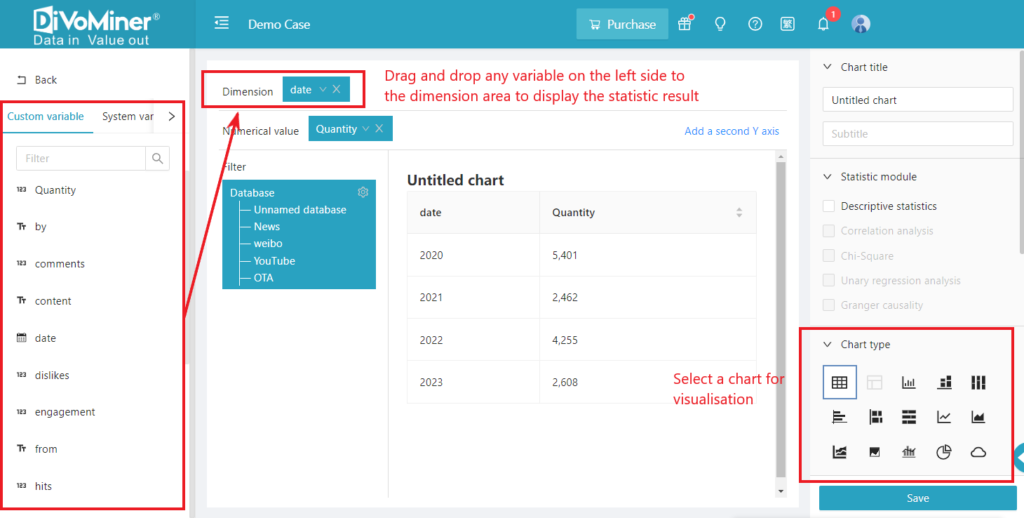
The default statistics in the [Numerical Value] field are based on “Quantity”. It can be changed to other variables if necessary. If you select the value of attributes such as the number of comments, it is recommended that you select the “Sum” statistics method in the drop-down of the field.
After charts are created successfully, as long as the settings of the category variable itself are not changed, such as the database has updated content or more coding results, the chart will be automatically updated without the need to recreate it.
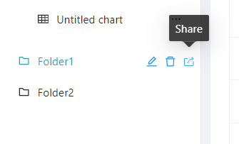
After generating the charts and folders, you can use the [Share] function to produce a public data work, making it easy for readers who do not have an account on the DiVoMiner platform to read the charts and view the data.
Click here to learn how to share your data visualisations with others
More methods of statistical analysis and graphing:
How to create a word cloud (cut words, word frequency statistics)?
How to do correlation analysis?
How to do regression analysis (univariate and multivariate)? How to do advanced statistics?