
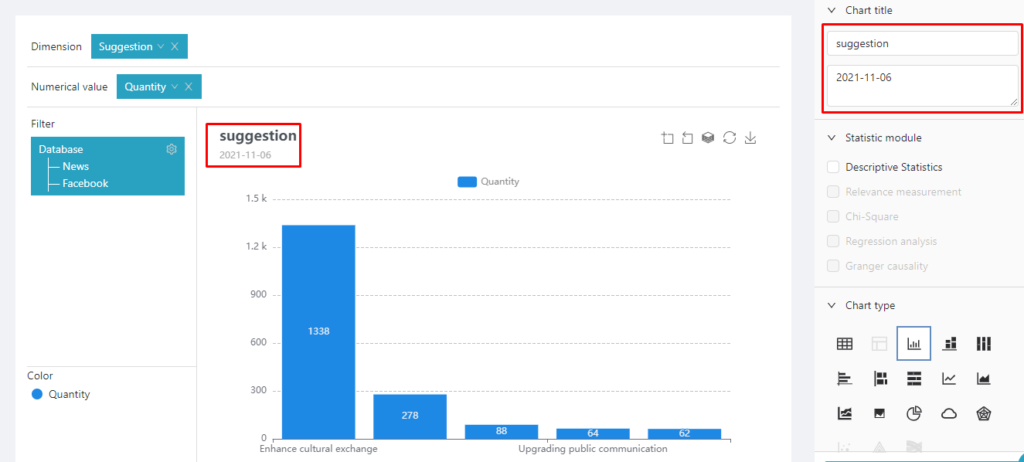
Chart name
The title of the newly created chart can be modified here, and a subtitle can be added to the chart as required. Taking the table with a number of samples for example, the title and subtitle of the chart can be set as follow:
Function setting
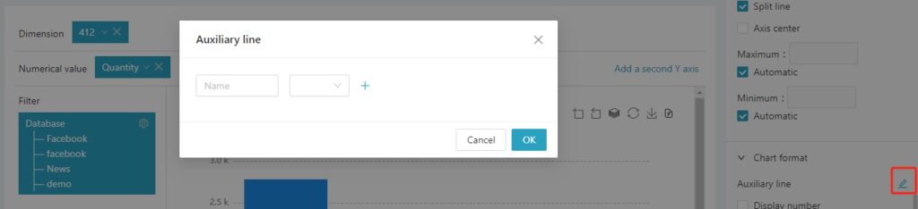
- Auxiliary line
Users can add auxiliary line as needed. Auxiliary line can be set with two types of values, one is “fixed value” and the other is “calculated value.” “Fixed value” is a fixed value set by the user as the auxiliary line. As shown below:
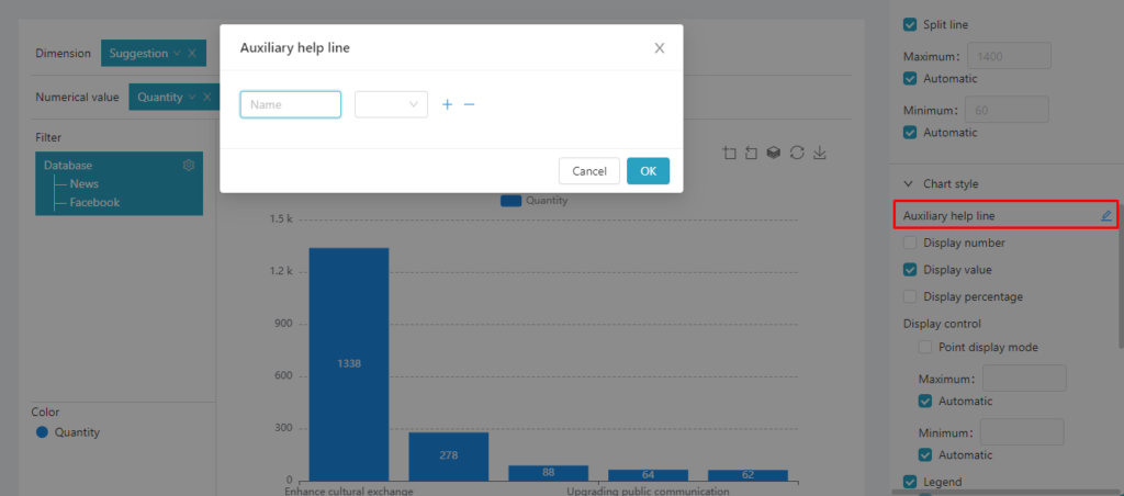
 “Calculated value” is calculated based on the variables put into the “Value” field. There are three types of calculation values, namely the “Average,” “Maximum,” and “Minimum.” As shown below:
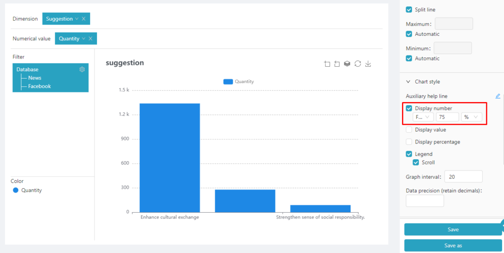
- Display filtered number: After turning on “Display filtered number”, the table data can be filtered. Three conditions are considered during data filtering, the “priority” ranking, the number of data retained, and the unit of the retained data (number or percentage). For example, If you need to show only the Top 3 categories in the table below, select the filter setting as follow:
If you need to show only the top 75% of all data in the table, select as in the figure below:
Coordinate X-axis
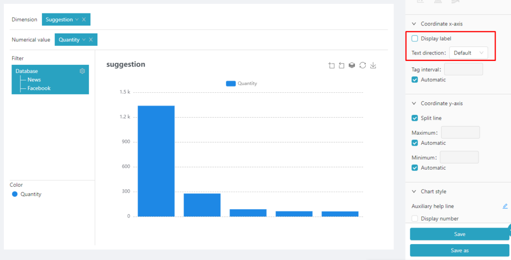
- Show label: if you cancel “Show label”, the label will not be displayed under the chart, as shown in the figure below:
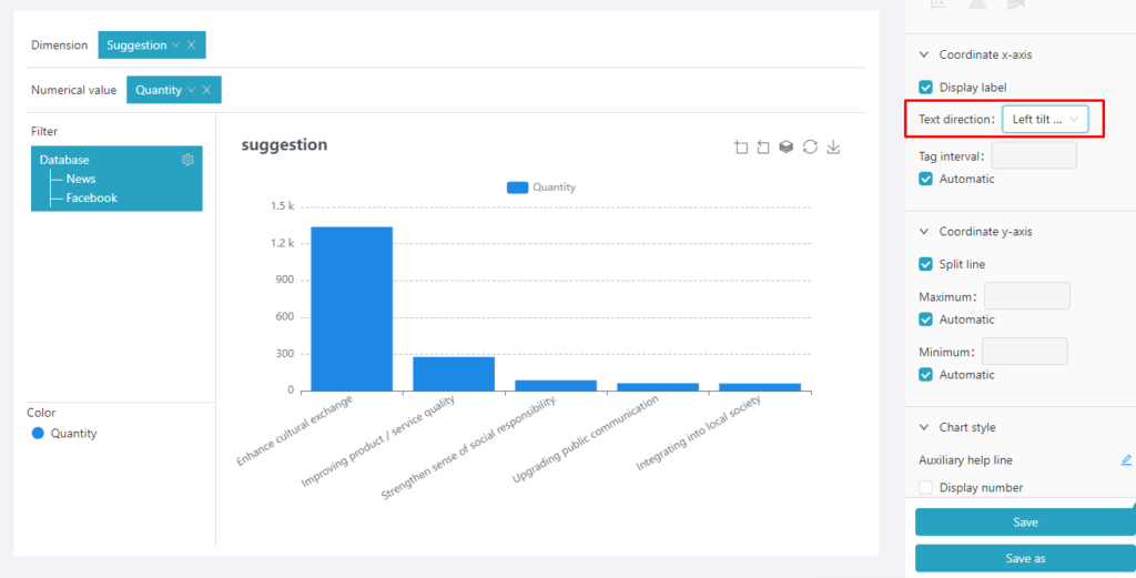
- Label rotate angle: “Label rotate angle” is suitable for long label name on the x-axis . Then, the label can be rotated to increase the space between the labels for full display, which is easier for reading. As shown in the figure below:
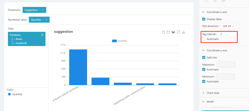
- Label interval: When it is not necessary to display all the labels on the x-axis, adjust the “Label interval”.
Label Interval: Specify the scaled interval between labels, as shown in the figure below:
Coordinate Y-axis
- Maximum/Minimum value: The maximum and minimum value is used to control the start and endpoints of the y-axis. If no setting is made, the maximum and minimum values of the y-axis will be automatically set according to the data in the figure. But users can adjust this value according to their own needs, and the minimum value must be greater than 0. As shown in the example below:
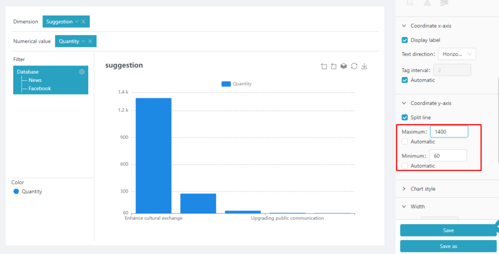
Chart style
- Display percentage: When this option is selected, the bar label will display the corresponding data percentage.
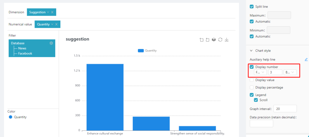
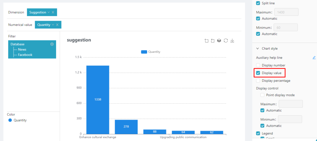
- Display value: When this option is selected, the bar label will display the corresponding data value (number of counts).
- Decimal places: Fill in the number of decimal places to be displayed. You can set the number of decimal places to be displayed in “Display percentage” and “Display value”.